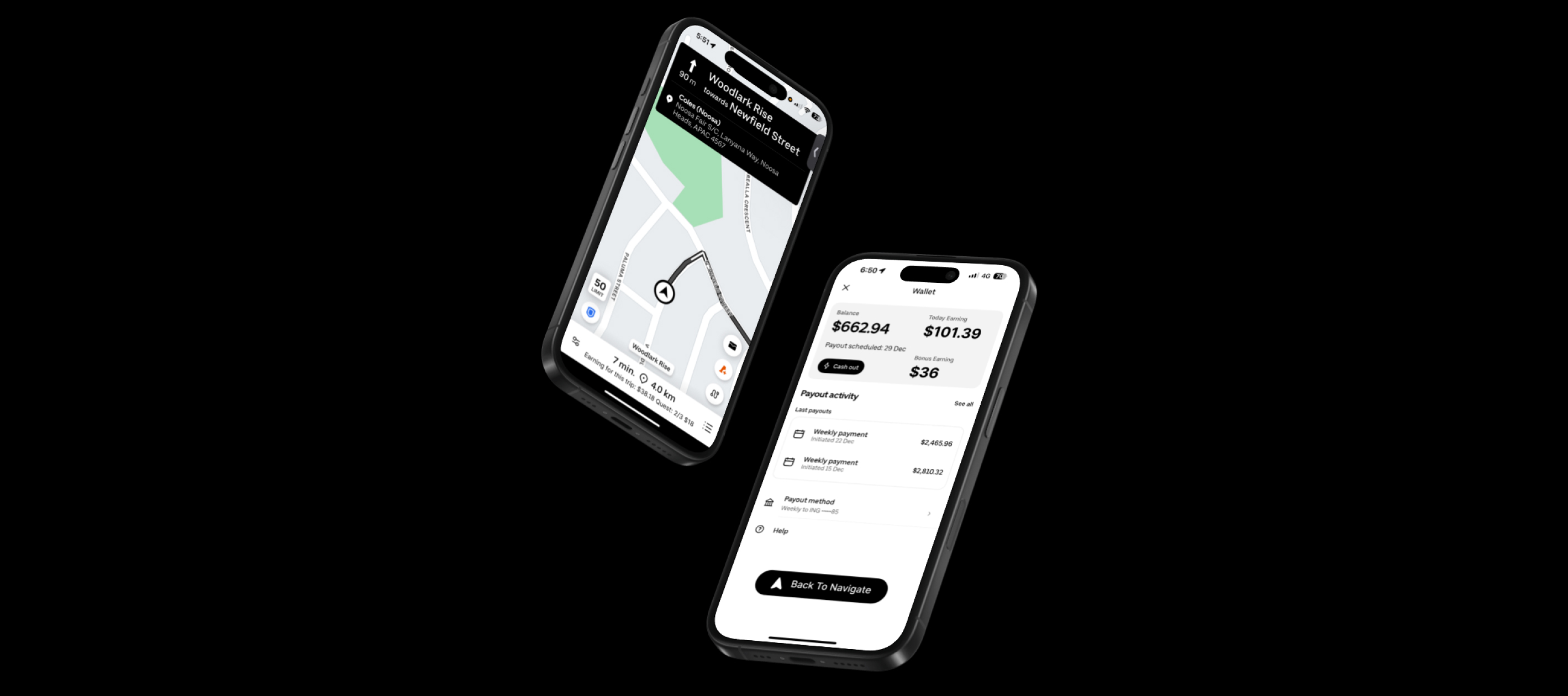
What Sparked This Idea
This case study began with a conversation with a full-time Uber driver — a close friend — who shared frustration about checking earnings during active navigation. While on a trip, accessing wallet information required swiping down a navigation banner, a gesture that was not immediately discoverable. Because the interaction lacked clear visual cues, it disrupted the driving flow and created unnecessary friction during an already cognitively demanding task. Although this insight originated from a single user, it revealed a usability gap worth exploring further. Curious about this friction, I conducted a feature audit of the Uber Driver interface and mapped the steps required to access financial information during an active trip.
Where the Flow Breaks
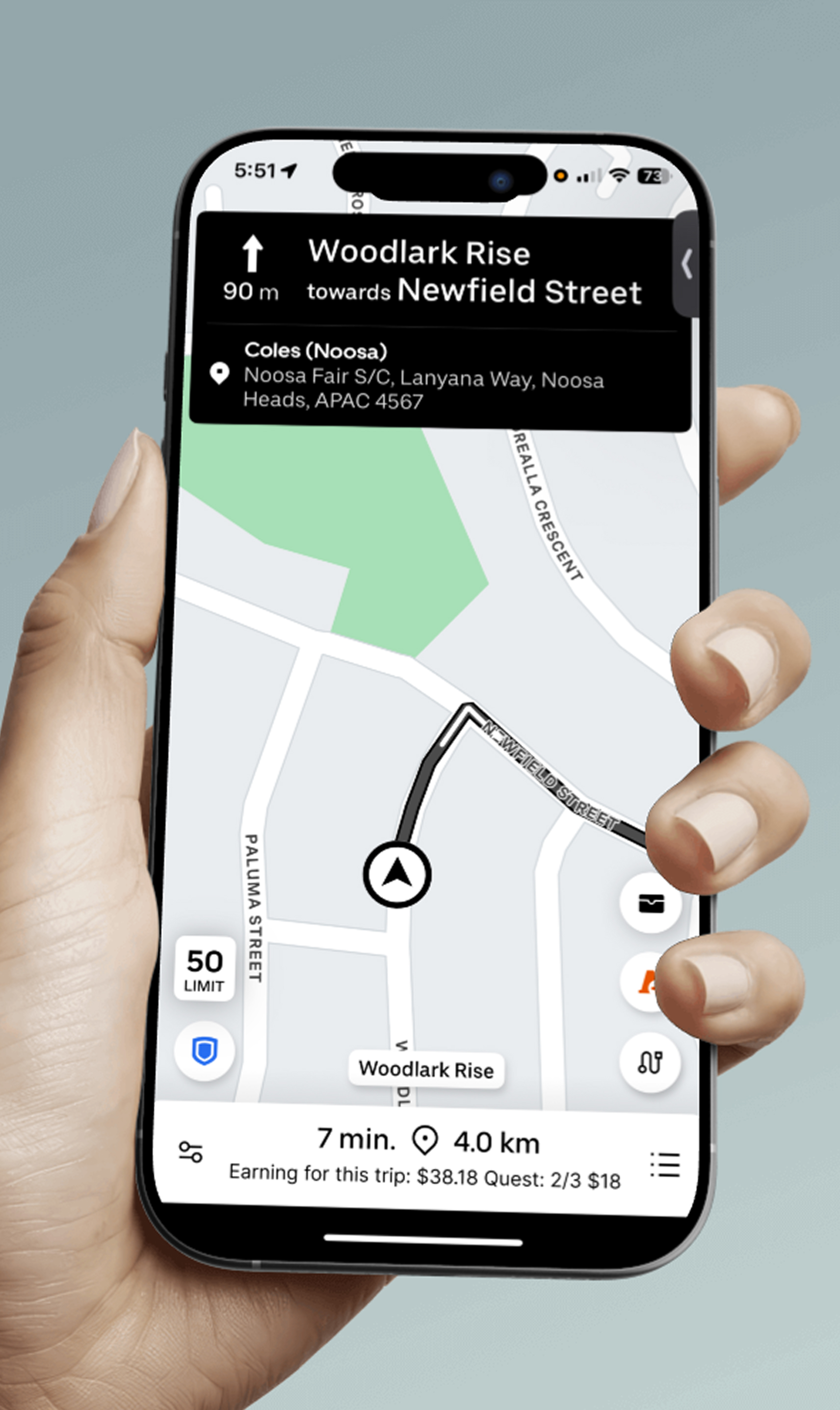
During active trips, Uber's navigation interface occupies most of the screen, while key financial information and wallet controls are hidden behind gesture-based interactions. Many drivers may not be aware that swiping down reveals additional options, creating unnecessary friction and increasing distraction during driving. This separation between navigation and earnings visibility makes it harder for drivers to access critical information at the moment they need it.
Drivers make financial decisions while navigating — but the interface doesn’t prioritize financial context.
Design Process
I began by auditing the current Uber Driver interface, capturing the key screens where earning information is accessed during an active trip. This helped identify exactly where the friction occurred and what needed to change.
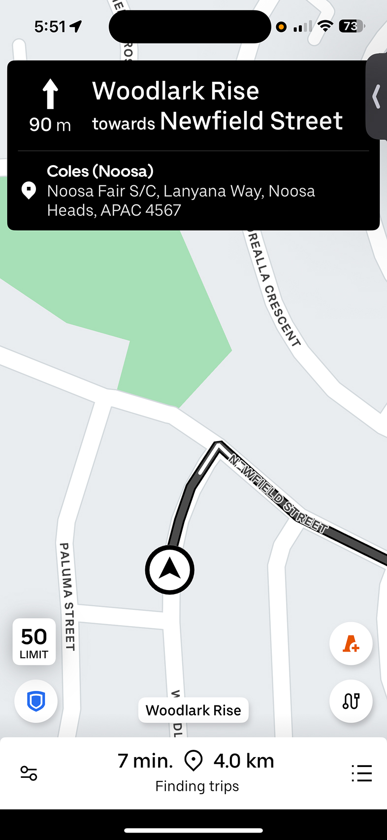
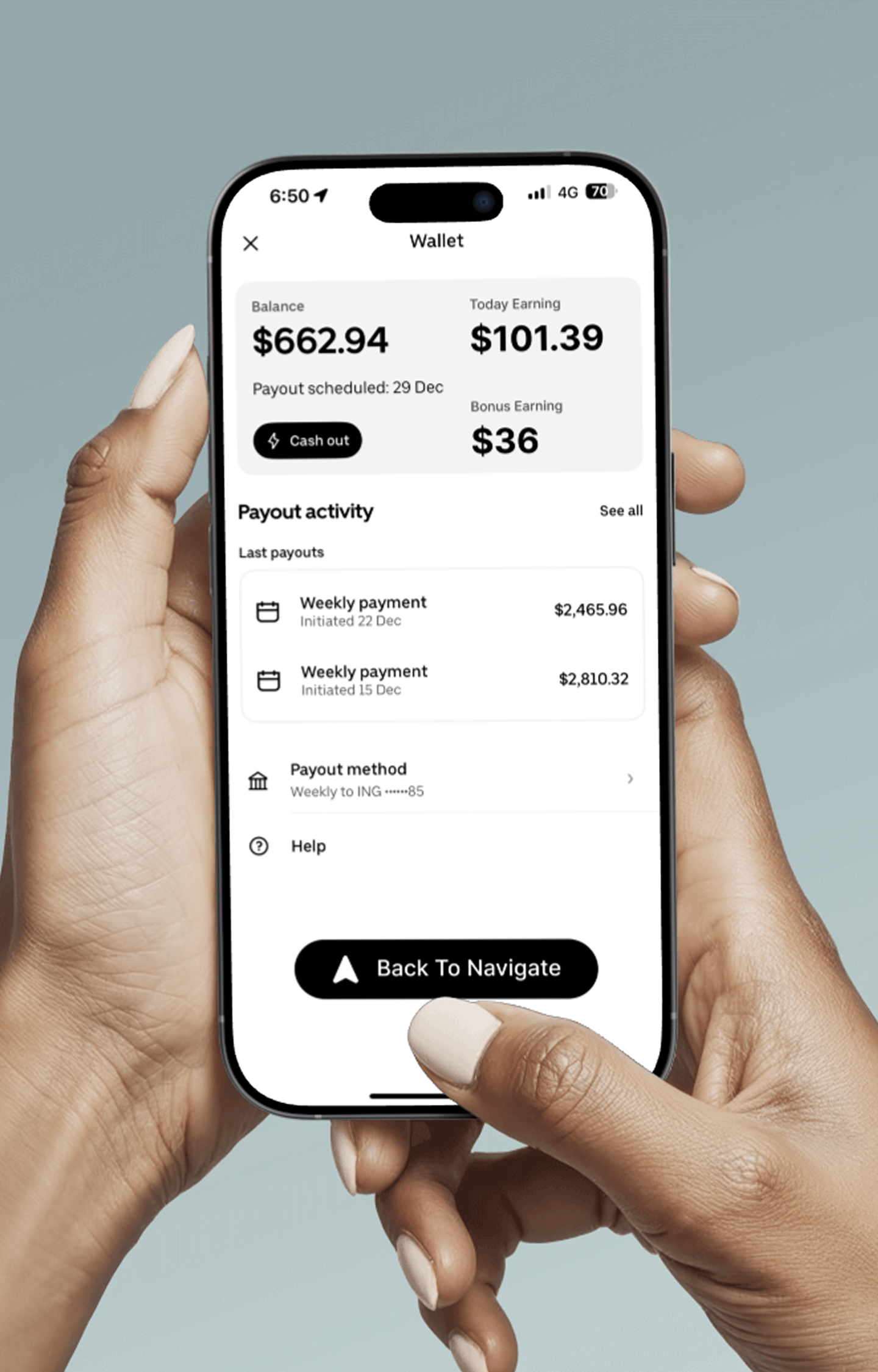
Before — Usability Gaps
- Earnings hidden behind a non-discoverable swipe gesture
- No financial visibility during active navigation
- Requires interrupting the primary task to access wallet
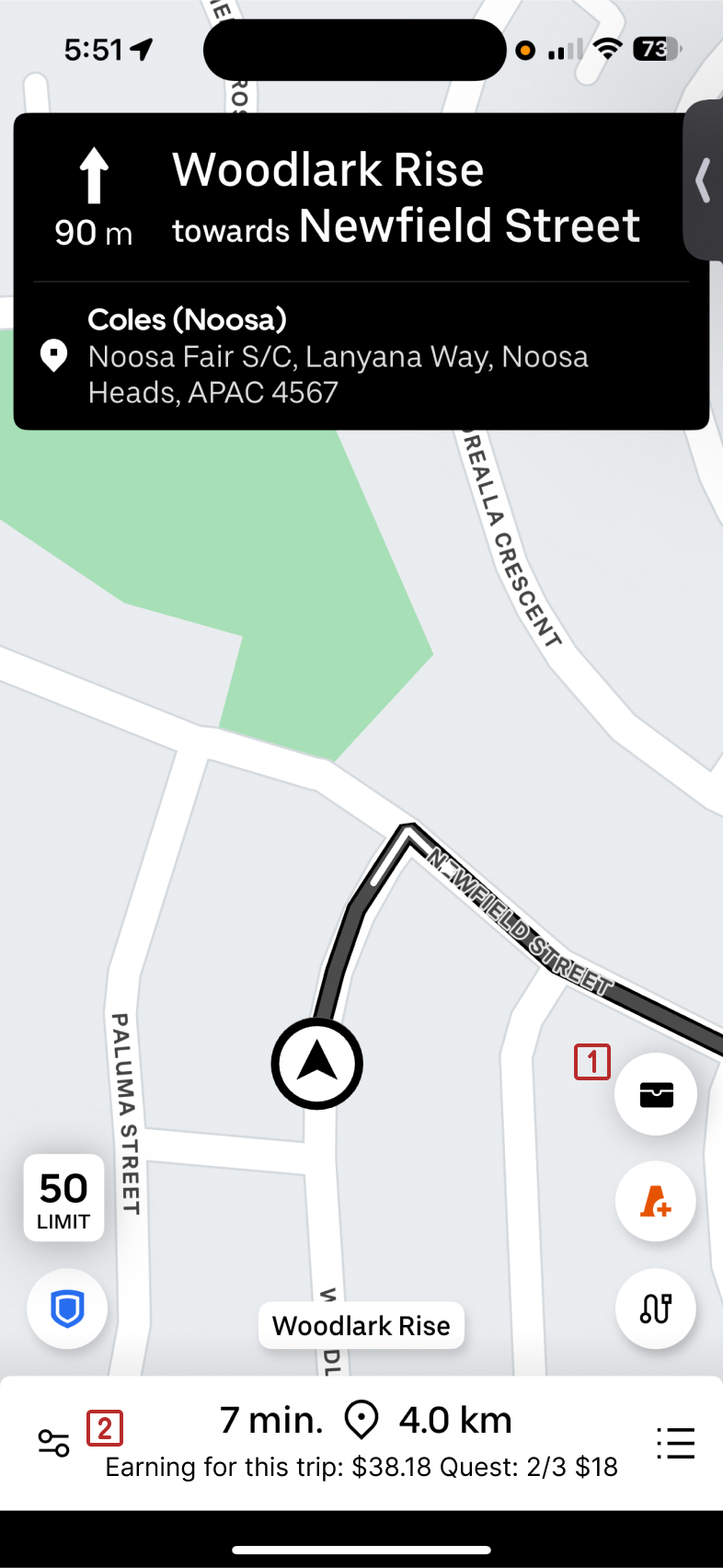
After — Design Enhancements
-
 Provides a clearly discoverable entry point to financial information
-
 Surfaces real-time earnings without requiring screen switching
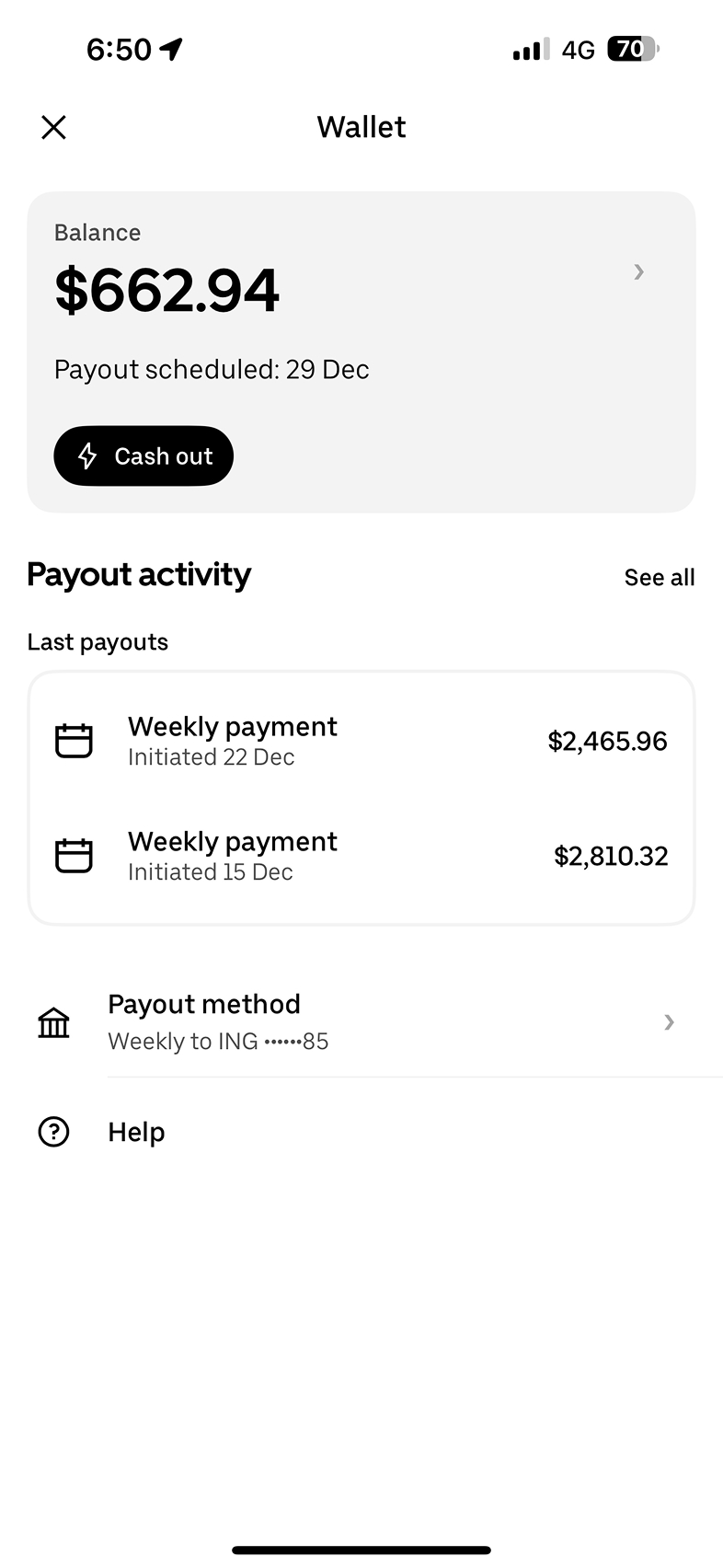
Before — Usability Gaps
- Today’s earnings not emphasized or easily scannable
- No clear breakdown of bonus or incentive earnings
- No direct way to return to navigation while ubering
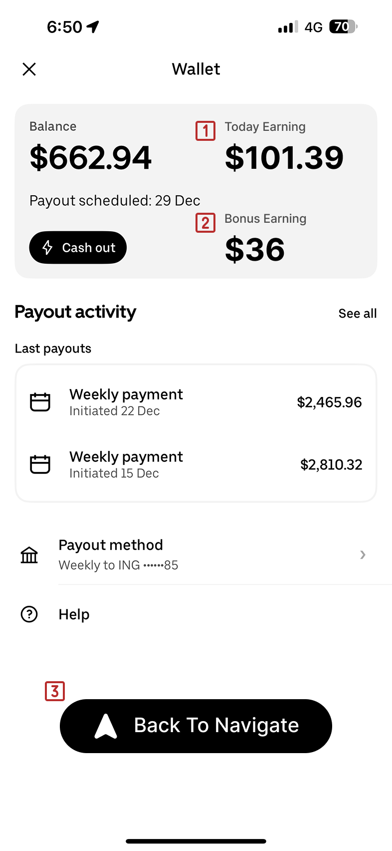
After — Design Enhancements
-
Surfaces daily earnings prominently to support quick financial tracking during active trips
-
Separates incentive earnings to improve financial transparency and clarity
-
 Provides a clear, single-tap return to the primary driving task
Final screens
Outcomes
Next steps would include usability testing to evaluate discoverability, task completion time, and cognitive load during active navigation.
What I Learned
This project reinforced how hidden interactions can create unnecessary friction, especially in high-cognitive contexts like driving. I learned that improving visibility within context often has more impact than redesigning entire screens. If I were to continue this project, I would conduct usability testing with active drivers to validate whether the persistent earnings display reduces perceived cognitive load.